Post Stastics
- This post has 1197 words.
- Estimated read time is 5.70 minute(s).
I spend a lot of time on the Flutter Slack channel (thanks Scott!), and I try and help as many people as possible during my breaks from my own work. Today I was asked how to implement multiple selectable groups of checkboxes in Flutter. I offered a solution which as is often the case, was met with “Can you show me some code?”. I didn’t have time at that moment but promised I would get an example done by end of the day. So, here goes!
Note that as with all software tasks there are many ways to solve this issue. Since I was dealing with a noobie I didn’t want anything to complex or that would hide aspects of the implementation from the coder. Sometimes the best solution is just a very straightforward one.
The first thing I did was to review what I knew about checkboxes in Flutter. You can find the docs here: https://api.flutter.dev/flutter/material/Checkbox-class.html. With that done, I decided to create a model to hold the data and methods needed for each checkbox. I could have taken any number of other approaches such as using a mixin, extending the Checkbox widget, or using a design pattern (see my articles on Design Patterns in Dart). However, here I wanted a more straightforward approach so as not to unduly confuse the noobie I was writing this for.
So with a plan in hand I created a class that included members for the checkbox title, value, and callback handler. Since I also need to disable each checkbox, I added a boolean shouldToggle field to control when the checkbox should be active. Here’s the code for checkbox_model.dart:
import 'package:flutter/scheduler.dart';

class CheckboxModel {
  String title;
  bool value;
  bool shouldToggle = true;
  VoidCallback? onToggle;

  CheckboxModel({
    required this.title,
    required this.value,
    this.onToggle,
    this.shouldToggle = true,
  }) {
    onToggle = this.toggle;
  }

  void toggle() {
    if (shouldToggle) value = !value;
  }

  void enable(bool state) => shouldToggle = state;

  bool get isEnabled => shouldToggle;

  VoidCallback? handler() {
    if (shouldToggle) {
      return onToggle;
    } else {
      return null;
    }
  }
}
The checkbox model includes a constructor that initializes onToggle to the class’ own toggle() method. The toogle() method flips the state of the chackbox each time it is called. Additionally, there is an enable() method that takes a boolean argument. When true is passed to enable(), it enables the checkbox. The checkbox will be disabled otherwise. I also included an isEnabled getter so we can query the checkbox for it’s activity state. I also supplied a handler method that returns the onToggle callback method or null depending on the state of shouldToggle.
OK, now we have our CheckboxModel, we need to put it to work. We’ll do that by creating a very simple flutter app as follows:
import 'package:multi_checkbox_dox_demo/checkbox_model.dart';
import 'package:flutter/material.dart';

void main() {
  runApp(MyApp());
}

class MyApp extends StatefulWidget {
  const MyApp({Key? key}) : super(key: key);

  @override
  _MyAppState createState() => _MyAppState();
}
Above we create a basic StatefulWidget named MyApp and call the standard createState() method returning MyAppState. This is all standard boilerplate for a flutter app using Stateful Widgets. Next we need to create the MyAppState and build our layout.
class _MyAppState extends State<MyApp> {
  bool value = false;
  final checkboxes = [
    CheckboxModel(title: 'Test 1', value: false),
    CheckboxModel(title: 'Test 2', value: false),
    CheckboxModel(title: 'Toggle Group', value: false),
    CheckboxModel(title: 'Test 3', value: false, shouldToggle: false),
    CheckboxModel(title: 'Test 4', value: false, shouldToggle: false),
  ];

  @override
  Widget build(BuildContext context) {
    TextStyle style = TextStyle(fontSize: 28, fontWeight: FontWeight.bold);
    TextStyle style2 = TextStyle(fontSize: 14, fontWeight: FontWeight.bold);
    List<Widget> checkboxModels = buildCheckboxes(checkboxes);

    return MaterialApp(
      home: Scaffold(
        appBar: AppBar(
          title: Text('Multi-Checkbox Demo'),
        ),
        body: Container(
          padding: EdgeInsets.all(16),
          child: Column(
            crossAxisAlignment: CrossAxisAlignment.stretch,
            children: <Widget>[
              Padding(
                padding: const EdgeInsets.all(8.0),
                child: Center(child: Text('Multi-Checkbox Demo', style: style)),
              ),
              Container(
                decoration: BoxDecoration(
                  border: Border.all(),
                  borderRadius: BorderRadius.circular(12),
                ),
                child: Column(
                  children: [
                    checkboxModels[2],
                    Container(
                      margin: EdgeInsets.fromLTRB(16, 0, 16, 16),
                      decoration: BoxDecoration(
                        border: Border.all(),
                        borderRadius: BorderRadius.circular(12),
                      ),
                      child: Column(
                        children: [
                          Padding(
                            padding: const EdgeInsets.all(8.0),
                            child: Center(
                              child: Text("Group 1", style: style2),
                            ),
                          ),
                          checkboxModels[0],
                          checkboxModels[1],
                        ],
                      ),
                    ),
                    Container(
                      margin: EdgeInsets.fromLTRB(16, 0, 16, 16),
                      decoration: BoxDecoration(
                        border: Border.all(),
                        borderRadius: BorderRadius.circular(12),
                      ),
                      child: Column(
                        children: [
                          Padding(
                            padding: const EdgeInsets.all(8.0),
                            child: Center(
                              child: Text("Group 2", style: style2),
                            ),
                          ),
                          checkboxModels[3],
                          checkboxModels[4],
                        ],
                      ),
                    ),
                  ],
                ),
              ),
            ],
          ),
        ),
      ),
    );
  }
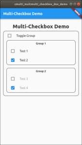
Here I create a sinple layout for the page and checkboxes. I create a list of checkboxes and picked the middle checkbox (checkboxes[2]) to be the one used for choosing the active group. I did a little visual grouping using borders and gave each group a title. Notice that in the list of checkboxes I pass a false value to shouldToggle to deactivate the last two checkboxes on startup.
Next we need to implement the buildCheckboxes method. This method will defer to the buildSingleCheckbox method. Using two method here helps us reuse code. First, the buildCheckboxes method:
List<Widget> buildCheckboxes(List<CheckboxModel> data) {
    return data.map((e) => buildSingleCheckbox(e)).toList();
  }
Pretty simple right? We just loop over the data stored in the list of checkboxes and call buildSingleCheckbox for each, passing the data. Then we create a list from all the created object and return that list. Next we need to create the buildSingleCheckbox method.
Widget buildSingleCheckbox(CheckboxModel model) {
    TextStyle style = model.shouldToggle
        ? TextStyle(color: Colors.black)
        : TextStyle(color: Colors.grey);

    return ListTile(
      title: Text(
        model.title,
        style: style,
      ),
      leading: Checkbox(
        value: model.value,
        onChanged: (_) {
          //model.handler();
          setState(
            () {
              model.toggle();
              swapEnabledGroup(checkboxes[2].value);
            },
          );
        },
      ),
      onTap: () {
        setState(
          () {
            swapEnabledGroup(checkboxes[2].value);
            model.toggle();
          },
        );
      },
    );
  }
The only non-standard things happening here are the test for the value shouldToggle to choose a text color at the top of the function. Next we create a ListTile, add our checkbox and label text. One issue that arose here was that I initially only added the checkbox onChanged handler. This made it so you had to tap or click the checkbox to toggle its value. Since I wanted the user to be able to tap on the label as well, I added the onTap handler for the ListTile. With this, the user can tap or click anywhere on the ListTile to activate the toggle of the checkbox state.
One issue we haven’t covered here is how to swap the active group. This is done by the swapEnabledGroup method. This method is passed the state of the checkbox at index 2 in the checkboxes list. It then uses the state of this checkbox to determine which group of checkboxes should be active. To deactive a checkbox we need to pass null to the chackbox’s onChanged handler. If you recall we created a method in the CheckboxModel to do just that. We called this method enable(). So we call this method in the swapEnabledGroup() method to set and reset the onChanged handle of each checkbox as needed.
void swapEnabledGroup(bool enableGroup1) {
    if (enableGroup1) {
      checkboxes[0].enable(false);
      checkboxes[1].enable(false);
      checkboxes[3].enable(true);
      checkboxes[4].enable(true);
    } else {
      checkboxes[0].enable(true);
      checkboxes[1].enable(true);
      checkboxes[3].enable(false);
      checkboxes[4].enable(false);
    }
  }
}
And with that, we have a working example of one way to handle multi-grouped checkboxes in flutter.
The code for this article can be found at: https://github.com/Monotoba/multi-grouped-checkboxes/blob/master/